This blog is an extract of a Johnson and Dagasan (2023) AEGC extended abstract.
Historical Core Photography from Carrapateena
How does computer vision and core photography compare to manual logging by an expert (or two in this case!) when logging fracture count and frequency? That is the question we aim to explore with this detailed comparison.
For this test we used 45,000m of historical core photography from BHP’s Carrapateena deposit that was collected between 2011 and 2013.
The Datarock Platform
Processing Raw photography into analytics-ready data
The Datarock platform was used to convert raw historical core photography into analysis-ready core row images. We won’t go into the details here but see the link below for a more detailed review of how this process works. https://datarock.com.au/blog/turning-raw-core-photos-into-analytics-ready-quantitative-data/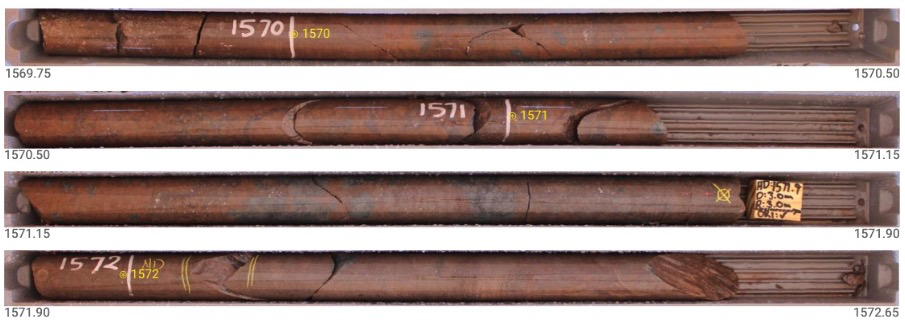
Example of depth registered core rows. This is generated by the Datarock platform, each row has assigned depth; yellow text with a circle represents the predicted depth markers.
Fracture detection
The Datarock platform uses the depth registered imagery described above and processes them through several computer vision pipelines to detect various classes of fractures and broken rock (see classes below). These detections are visually recorded as a bounding box object coloured by their class.
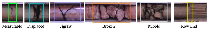
Examples of fracture detection classes.
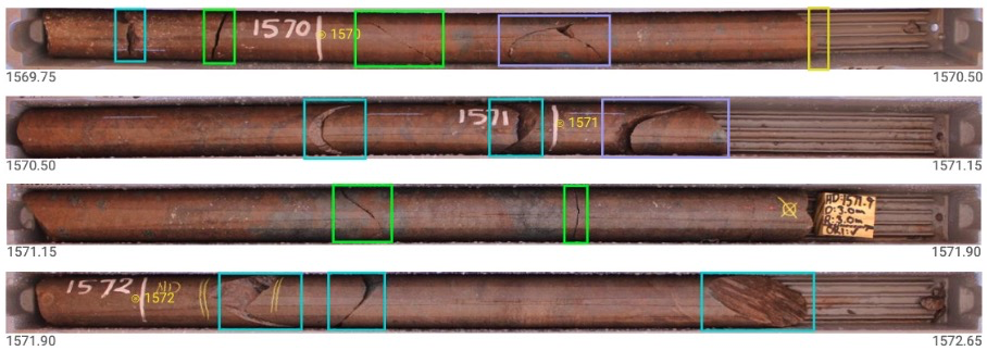
Example fracture detections.
Induced Breaks
Drilling and core handling can cause induced breaks, also known as mechanical or driller’s breaks.These can be difficult to distinguish from natural fractures, especially in images. Typically, induced breaks are marked with an “X” on the core. Our method assumes all breaks are natural unless consistently marked otherwise. To detect these marks, we trained another object detection model. The training data was selected to represent the overall variability, resulting in over 6,000 labels.

Example of induced break marks detected.
A fracture is classified as induced if it lies within a 3 cm distance of an induced break mark. Carrapateena’s imagery had these marks consistently recorded and visible to the camera. This allowed induced breaks to be effectively excluded from further analyses.
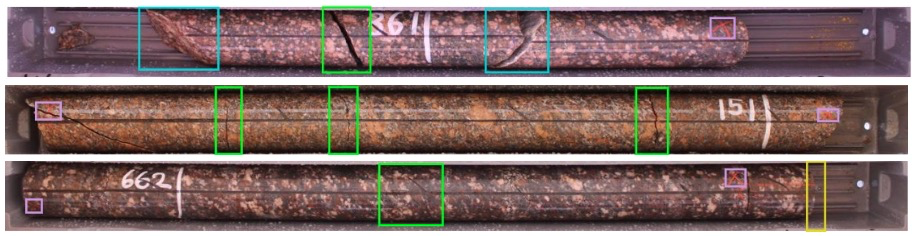
Several examples of induced break mark detections (small pink boxes). If a fracture is near an induced break mark, it was classified as an induced break and excluded from further analysis.
Calculating Fracture Frequency
The outputs from Fracture Detection/Classification and Drillers Break models were combined to calculate fracture frequency.
When dealing with zones of broken material, it is not practical to count individual fractures as they can comprise densely packed networks of fractures. To account for this, it is common to assign 4 fractures per 10 cm of broken zone. Since we can identify and categorise different types of ‘complex’ fractures, we introduce a modified fracture count system for each complex fracture type. We term these `Equivalent fracture counts`. The remaining fracture classes (measurable, displaced and row end) are termed ‘simple’ fractures and are given a count of 1.
|
Broken Zone Type |
Equivalent fracture count per 10 cm |
|
Jigsaw |
2 |
|
Broken |
4 |
| Rubble |
5 |
Equivalent fracture counts for each type of complex fracture class.
Equivalent fracture counts presented above are derived from an optimisation of this method against traditional high quality geotechnical logging across several deposit types. Total equivalent fracture count for a given interval can be calculated using the following equation:
Total Equivalent Fracture Count = Simple Fracture Count + Complex Equivalent Fracture Count
Fracture Frequency can then be calculated using the following equation:
Fracture Frequency = Total Equivalent Fracture Count / Interval Length
Predicted Fracture Frequency versus Manually Logged Fracture Count
Creation of a Comparison Dataset
124 intervals (about 2% of the total 44,923m dataset) were randomly selected, covering 1 to 70 fractures per metre across various drill holes.
Two experienced geologists logged these intervals from core photography, estimating individual fracture counts and broken rock lengths. This data was then converted into fracture count and equivalent fracture count data and fracture frequency data.
Assessing the consistency of manual logging
We first examined how consistent the two geologists were in their logging. A scatterplot comparing their fracture count data showed some variations, mainly due to different interpretations of broken rock interval lengths and boundaries. Despite these minor differences, the results demonstrated a strong correlation overall.
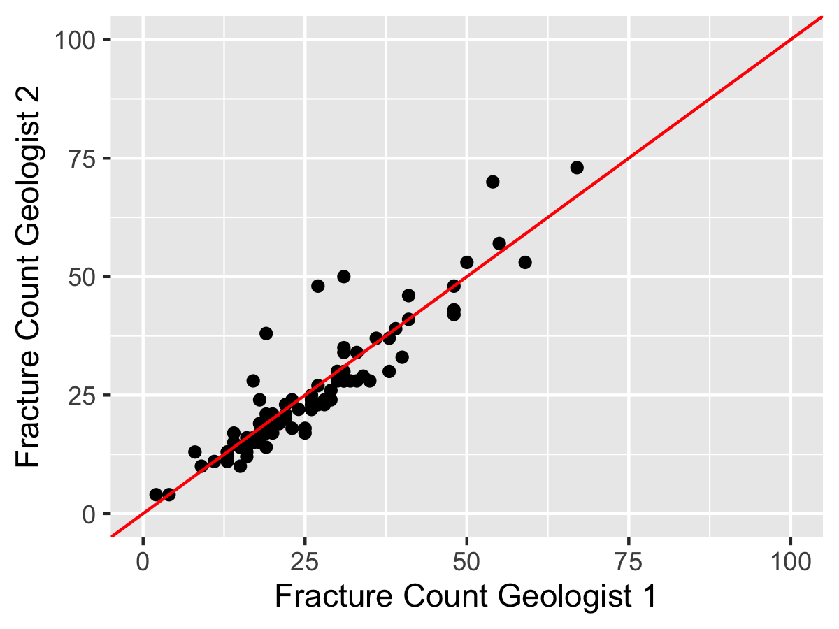
Comparison of the fracture count data manually logged by two experienced geologists.
The average of the two geologists’ fracture count data was compared to the model’s predictions. Results show that the computer vision-based model performs well against manual logging, with an r-squared value of 0.92. This high correlation indicates strong agreement between the automated and manual methods.
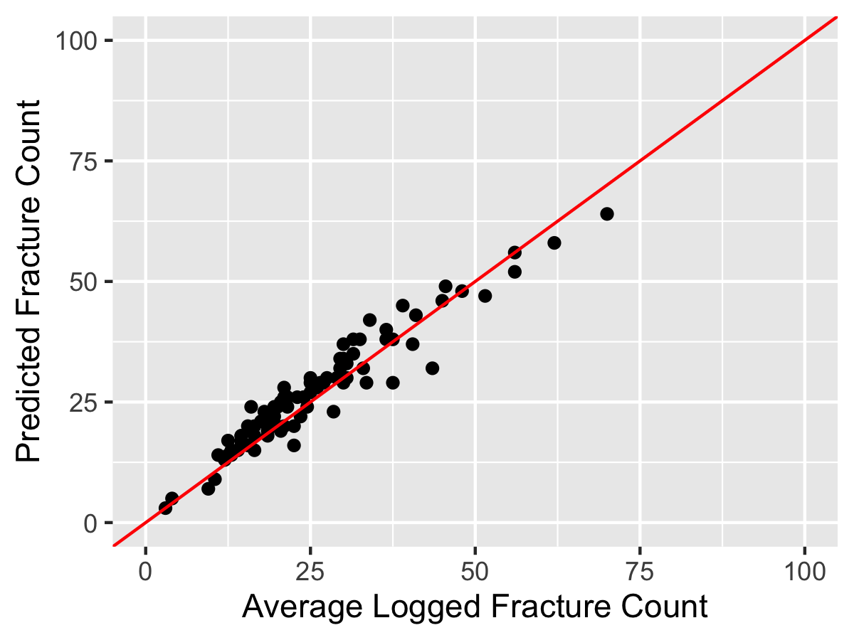
Comparison of the Datarock predicted vs geologist logged fracture counts.
Analysis of the Equivalent Fracture Count Data
Counting the number of fractures on a core can become challenging when the collected samples contain broken zones. As mentioned previously, it is common practice to assign 4 fractures per 10 cm of broken rock, as this is the maximum fracture frequency as suggested by the RMR system. Logging to this scheme relies on multiple geologists or engineers to interpret the length and grain size of broken zones in the same way to achieve a consistent result.
The two geologists estimated broken zone lengths and assigned fracture counts accordingly. Their averaged results were compared to the automated method’s predicted equivalent fracture count. This comparison showed slightly higher variability (r-squared value of 0.79) than the earlier fracture count comparison. This increased variability is predominantly related to the highly variable interval sizes being used in the calculation.
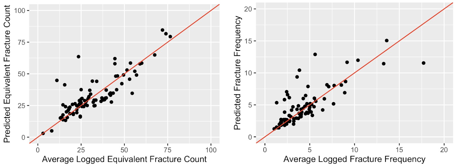
Comparison of the Datarock predicted vs logged Equivalent Fracture Count (right). Comparison of Datarok predicted versus logged fracture frequency.
Benefits
If automated methods such as those shown in this short comparison can produce datasets of equivalent quality to an experienced logger, then it opens the door to many potential improvements in the way this type of data is collected in terms of coverage, efficiency and QAQC.
Key benefits include the ability to:
- produce geotechnical data at large scale on historical core that has been cut or otherwise destroyed,
- easily collect baseline geotechnical datasets on all diamond core, rather than selective logging due to economic constraints,
- produce geotechnical data with a digital audit trail to improve accountability and quality assurance, and
- replace, augment selected manual logging to help address skills shortages currently being experienced globally.
Conclusion
In this detailed experiment using a real world dataset we have shown the Datarock workflow can successfully detect, classify, and extract fracture count and frequency information from average quality, 12 year old historical core photography. When applied to imagery from the Carrapateena IOCG deposit, our automated method produced results comparable to those of multiple trained geotechnical loggers.
Stay tuned for our follow up blog on the impacts of this data at the Carrapateena deposit for downstream rock mass characterisation and block cave design.