Created by Putra Sadikin, Brenton Crawford and Rian Dutch
Overview
Traditionally, core photography has been used by geologists and geotechnical engineers for visual inspection. However, it has seldom been utilised as a quantitative dataset for analysis alongside crucial downhole data like geochemistry.
Core photos are a rich source of geological information, especially regarding aspects such as colour, texture, and mineralogy. Importantly, the data from core photography complements the information provided by geochemistry.
So, why haven’t we been analysing core imagery and geochemistry together for years? In their raw form, core photos are challenging to use for analytics and require significant processing to unlock their geological information.
The Datarock Platform is designed to transform raw core photography into analytics-ready data and create supervised and unsupervised models that convert these images from something to be viewed into something that can be numerically analysed alongside geochemistry.
The aim of this blog is to demonstrate how we can analyse both geochemistry and core imagery together using ioGAS and the Datarock Platform, and to highlight why these datasets are so valuable when used together. Or, as David Lawie likes to call it, “Photogeochemistry.”
Geological Context
Data for this blog comes from the Geological Survey of South Australia’s Mineral Systems Drilling Project (MSDP) in the Gawler Range Volcanics. The MSDP was a collaborative initiative managed by the Geological Survey of South Australia (GSSA) to refine geological models and identify mineralization controls in a challenging terrain where exploration models had not been established. The program aimed to extend understanding of the 1590 Ma magmatic-hydrothermal event along the southern margin of the Gawler Ranges and improve understanding of the lithological variability, thickness, and structural controls on the Gawler Range Volcanics.
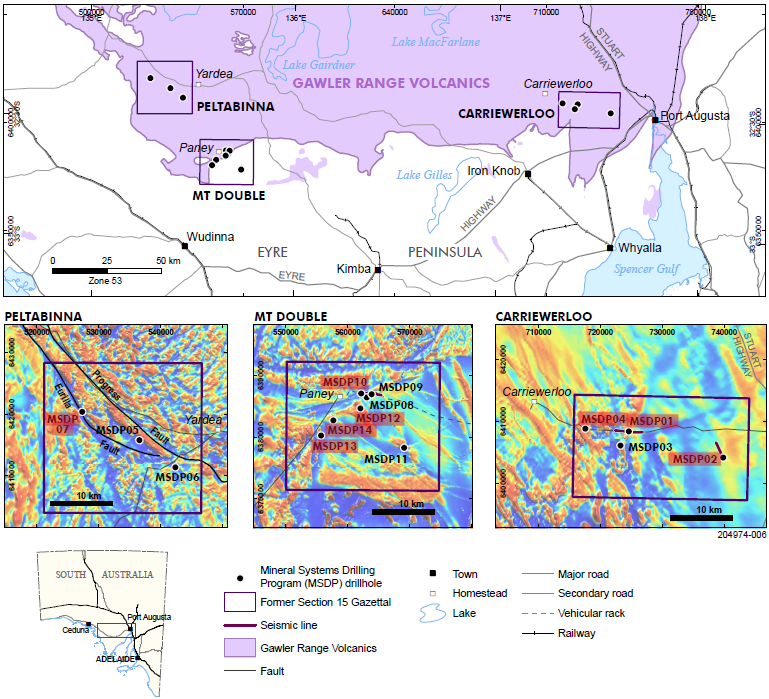
Figure 1. Location of the MSDP drilling program and drill holes. Holes used in this study are highlighted red. Figure modified from Fabris 2017.
The Data
The MSDP program collected core samples, down-hole geochemistry and geophysical data from 14 drill holes across three project areas (Figure 1). For this experiment we used core photography taken at site as well as the Lab At Rig geochemistry also collected on the drill site. All of this data is freely available from the GSSA’s SARIG web portal. For this blog we have focused on a single drill hole MSDP04.
Exploring imagery data from Datarock in ioGAS
The Datarock Platform creates several different types of data from raw core photography including simple RGB dominant colours, image descriptive features, geotechnical and geological datasets which we will describe below. For this study we have chosen a basic set of outputs that can be produced.
Colour
The purpose of the Datarock Dominant Colour product is to condense the varied colours represented in the image to consistently determine the dominant colour of each row of the core. The link below has more information on how Datarock calculates the dominant colour – https://help.datarock.com.au/knowledge-base/dominant-colour
This dataset is really useful as an ancillary dataset when viewing the geochemistry and other image features and will be used in several plots as context.
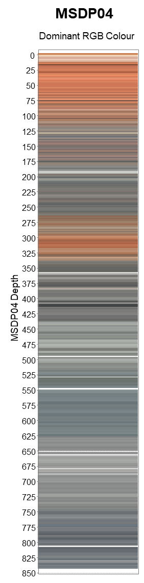
Figure 2. Dominant RGB colour from each cropped and depth registered row of core photography from MSDP04. White areas represent imagery gaps.
Rock Condition and Geotechnical data
The physical condition of the diamond core is another valuable dataset to consider alongside geochemistry and other downhole data. It can reveal faults, shear zones, and the overall condition and quality of the rock mass. Datarock generates this data by detecting each rock fragment in the images and classifying them as unbroken (coherent), broken, or out of place (incoherent). Additionally, it identifies other objects in the tray, such as core blocks, empty spaces, and regions with an empty tray.
See more information on how Datarock produces this dataset here: https://help.datarock.com.au/knowledge-base/analytics-ready-data-image-preparation-depth-registration
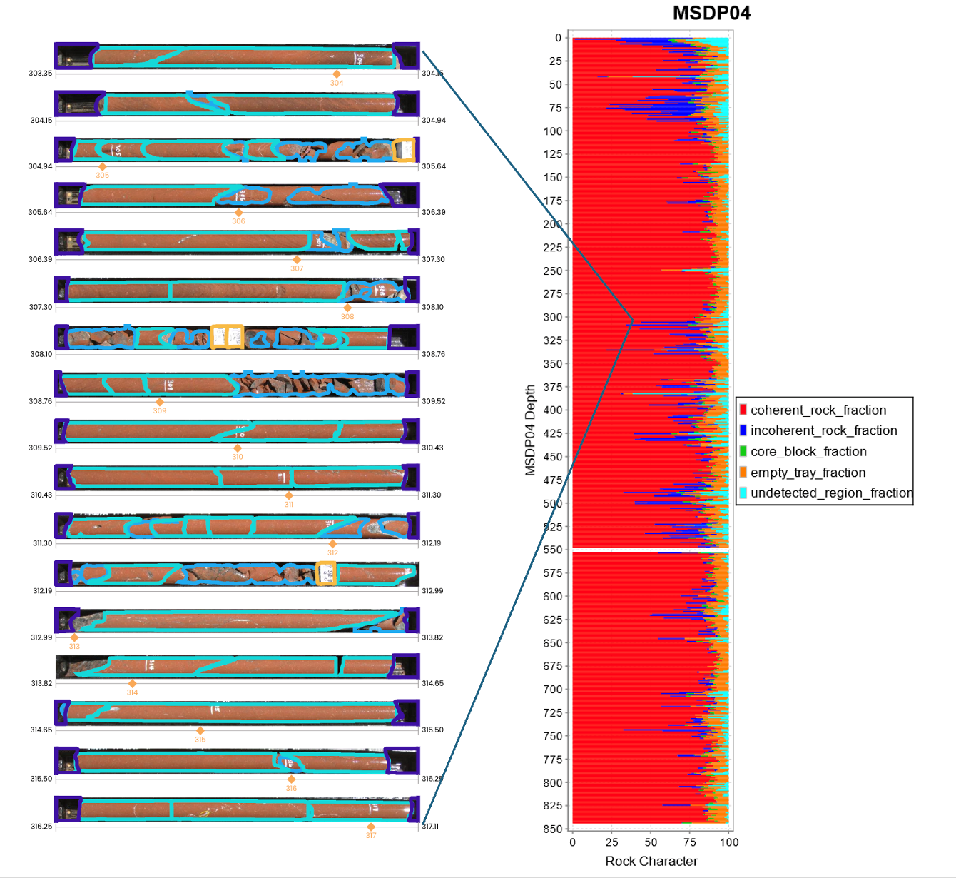
Figure 3. Rock character data from Datarock computer vision models (left) plotted as a stacked bar chart in ioGAS (right).
Unsupervised Analysis
There are a variety of methods to generate numbers that describe the visual appearance of a core image, these range from simplistic methods such as Grey Level Co-Occurence Matrices (GLCM), up to more complex techniques that leverage Deep Neural Networks. The Datarock Platform is able to generate descriptive features (variables) that do an excellent job in numerically describing the colour, texture and overall appearance of a rock image. In this example we have used these features to do some unsupervised image clustering to understand geological domains present within the imagery and build domains based on visually similar core intervals.
In the plot below, each data point represents an image tile taken from the cropped and depth registered row image. We have used a dimensionality reduction technique called UMAP (Uniform Manifold Approximation and Projection – https://datarock.com.au/blog/whats-the-uncertainty-on-your-umap/) which allows the high dimensional image features to be reduced to 3 dimensions. We won’t go into this method deeply but at a high level data points which plot close together in UMAP space should look visually similar. We have then clustered these features and plotted the cluster colours on the data so they can be compared with the downhole plot below.
Check out this blog to find out more about CNN image features and UMAP https://datarock.com.au/blog/fusing-core-imagery-and-chemistry-to-model-stratigraphy/
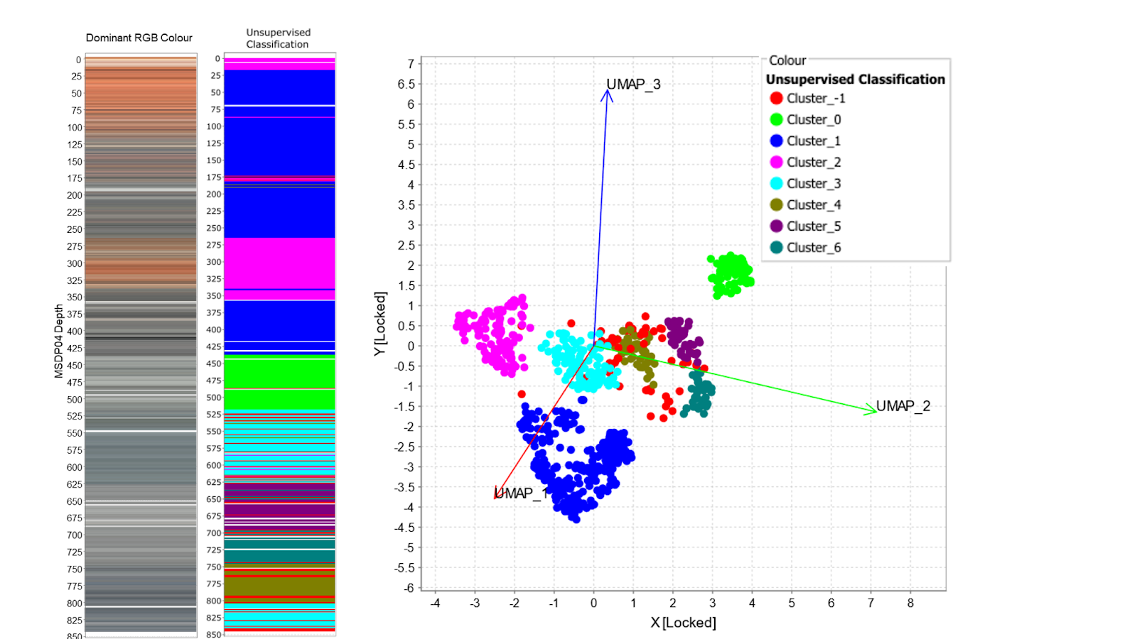
Figure 4. MSDP04 downhole plots with (left) Dominant RGB colour (right) DBScan cluster colours (red -1 represents outlier points). 3D UMAP of image features coloured by DBScan clusters.
Supervised Analysis
A supervised lithology classification model was constructed in the Datarock Platform by building a training dataset of around 500 5cm x 5cm images for each lithology. This model was trained from imagery taken across the entire MSDP set of drill holes and predicted onto MSDP04. The resultant simplified lithology model is shown in the figure below alongside the lithology logs created by the GSSA (Figure 5). Using the imagery only, this image classification model picks most of the main lithology boundaries in MSDP04, but does contain some confusion in the bottom half of the hole where the imagery contains some non geological variation (shadows, reflections etc).
The link below has more information on how Datarock produces image classification models – https://help.datarock.com.au/knowledge-base/unique-classification
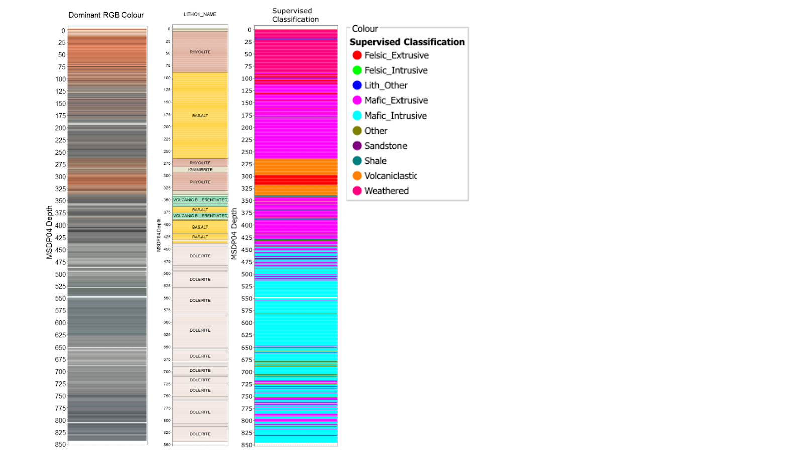
Figure 5. Downhole plots from MSDP04 showing (left) dominant RGB colour, (centre) Lithology logs from GSSA and (right) Supervised image classification from the Datarock Platform.
Analysing geochemistry data in ioGAS
Geochemistry data was collected from the Lab-at-Rig (LAR) project, where samples are collected every approximately 1m. Cuttings from IMDEX’s Solids Removal Unit (SRU) were split, dried, crushed and pressed into pellets which were analysed by portable XRF on-site for a 34 element suite. 24 elements were chosen for further interpretation based on the percentage of data above the detection limit (i.e. DL, > 50% above DL).
Unsupervised Analysis
Uniform Manifold Approximation and Projection (UMAP) was used on the 24 selected elements, which were transformed to Log10 and scaled from 0 to 1.0 prior to analysis. The resulting 2 UMAP dimensions were clustered using the Density-Based Spatial Clustering of Applications with Noise (DBSCAN) technique, which identified 11 clusters (Figure 6).
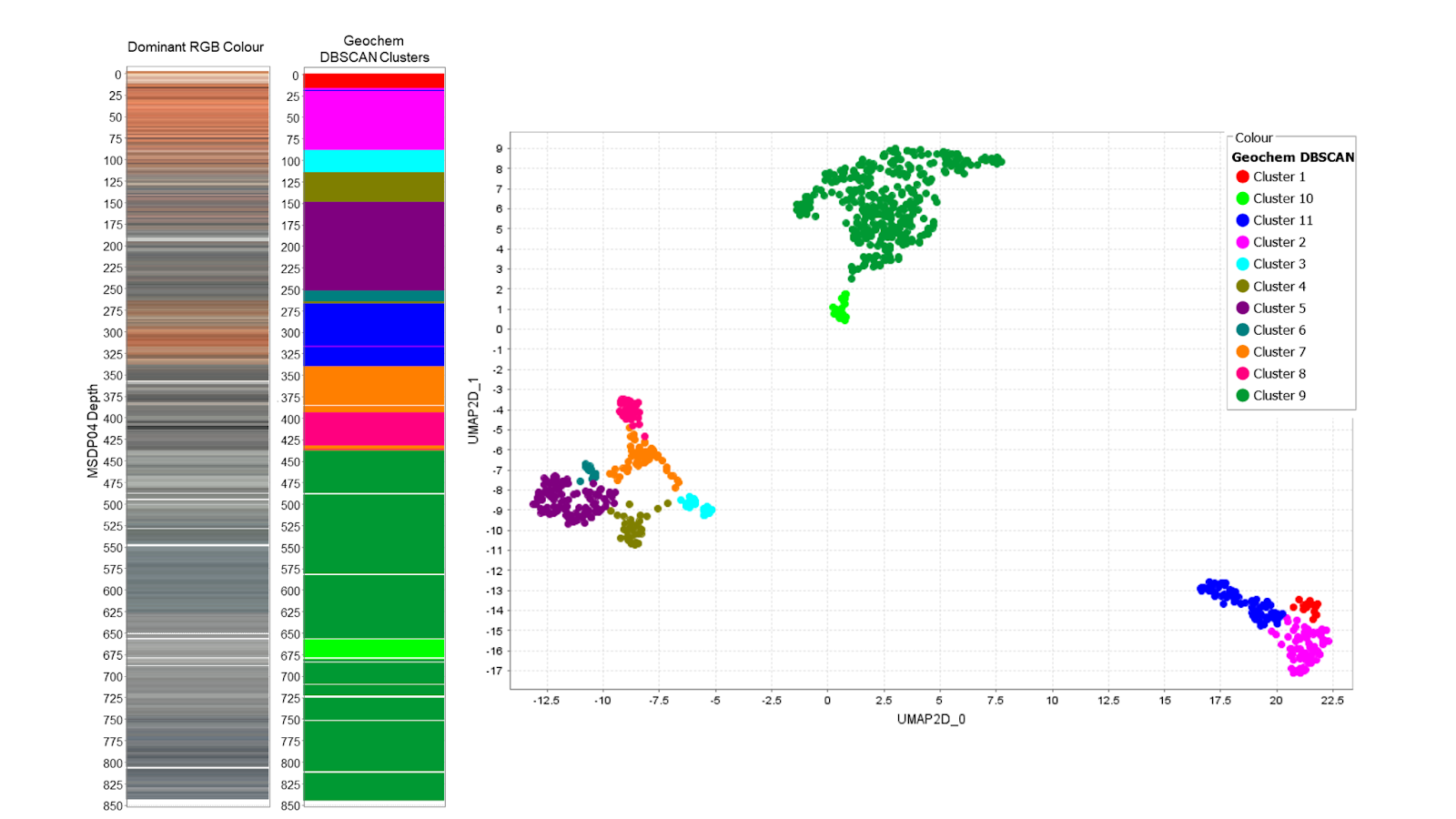
Figure 6. MSDP04 downhole plots with (left) Dominant RGB colour (right) DBScan cluster colours. 2D UMAP of LAR geochemistry features coloured by DBScan clusters.
Comparing geochemistry and imagery in UMAP space
By visualising the data in similarity space we can see how discrete and well separated the data is. As we mentioned previously, data points that plot close together should be similar in terms of either their multivariate geochemical signature or visual appearance.
The geochemistry and imagery UMAPs below both show clear structure with obvious groups of data but with some interesting differences. The geochemistry groups into 3 very distinct groups with some other less distinct sub groups. While the imagery UMAP shows groups a similar number of groups that are less well defined and slightly more continuous overall. Some of the groups match across the dataset with other groups showing some interesting differences.
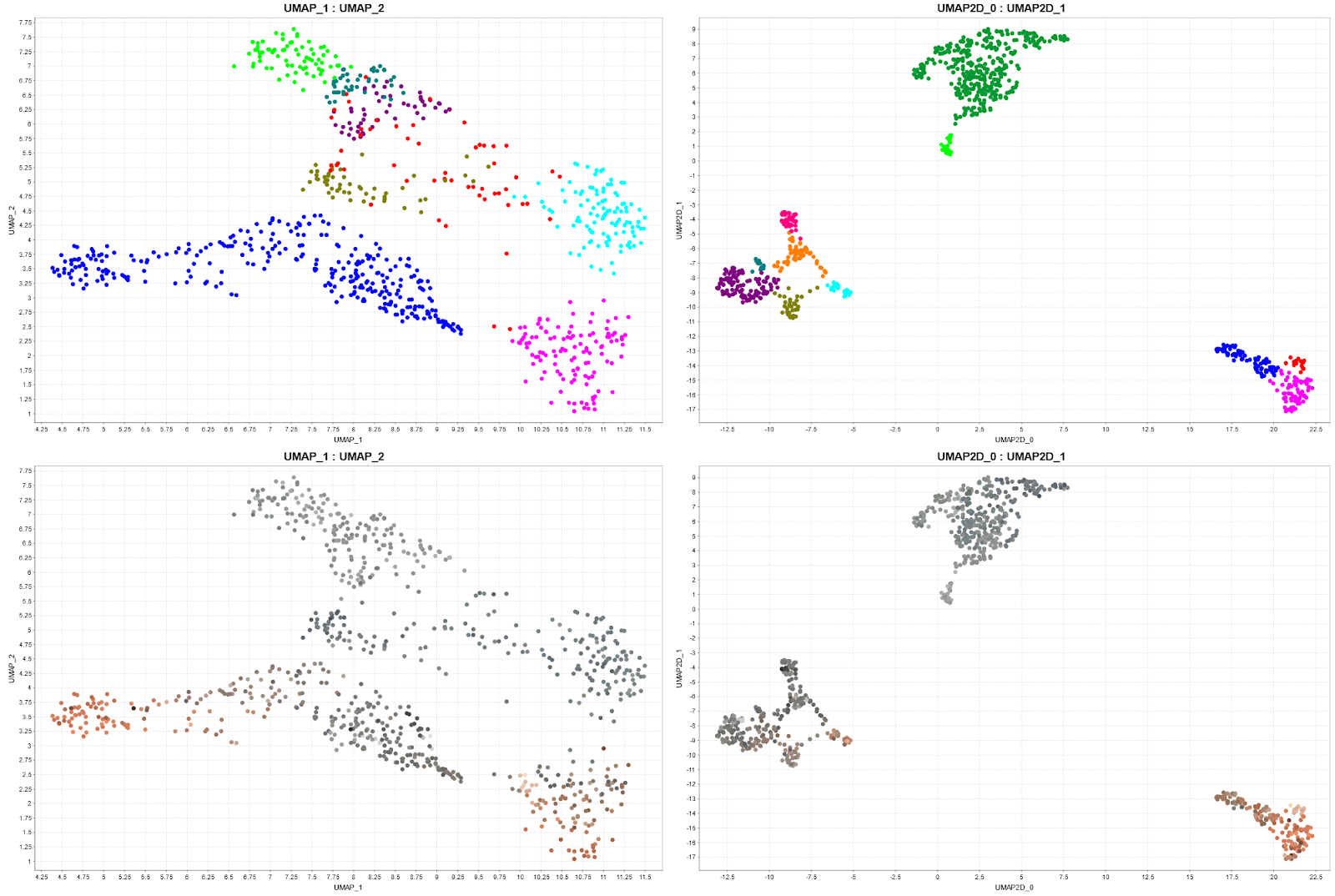
Figure 7. UMAP of imagery vectors (left 2 plots) and UMAP of geochemistry variables (right 2 plots). The colours on the top 2 represent unsupervised DBScan clusters, and the colours on the bottom 2 plots are dominant RGB colours per interval.
Comparing geochemistry and imagery domains and boundaries with distance metrics and wavelet tessellation
To demonstrate the complementary aspects of analysing imagery and geochemistry together we will explore some methods in ioGAS that we can use to analyse the similarities and differences between domains and boundary positions in each dataset.
Comparing domains using wavelet tessellation
Wavelet tessellation is a two-step process that begins with a Gaussian wavelet transform applied to UMAP vector sums, followed by a tessellation method that creates regularised geometries on the transform. This technique generates tessells of varying densities that can be used to identify geological boundaries at different scales.
The selection of the appropriate scale for tessellation is subjective and depends on the geological knowledge and the desired level of detail. Once a scale is chosen, the mean of each tessell at that scale is calculated. In this case, tessellation serves as a guide for boundary identification.
By comparing wavelet tessellation results of imagery and geochemical UMAP embeddings, we demonstrate the advantage of incorporating textural context into geochemical data interpretation. It emphasises the role of texture, such as grain size and colour, in identifying rock types, which may not be discernible through geochemistry alone. While the geochemical UMAP wavelet tessellation plot distinguishes between major rock types like rhyolite, basalt, and dolerite, it has limitations in detecting subtle variations within these categories. However, imagery UMAP embedding clustering refines these boundaries by considering visual patterns.
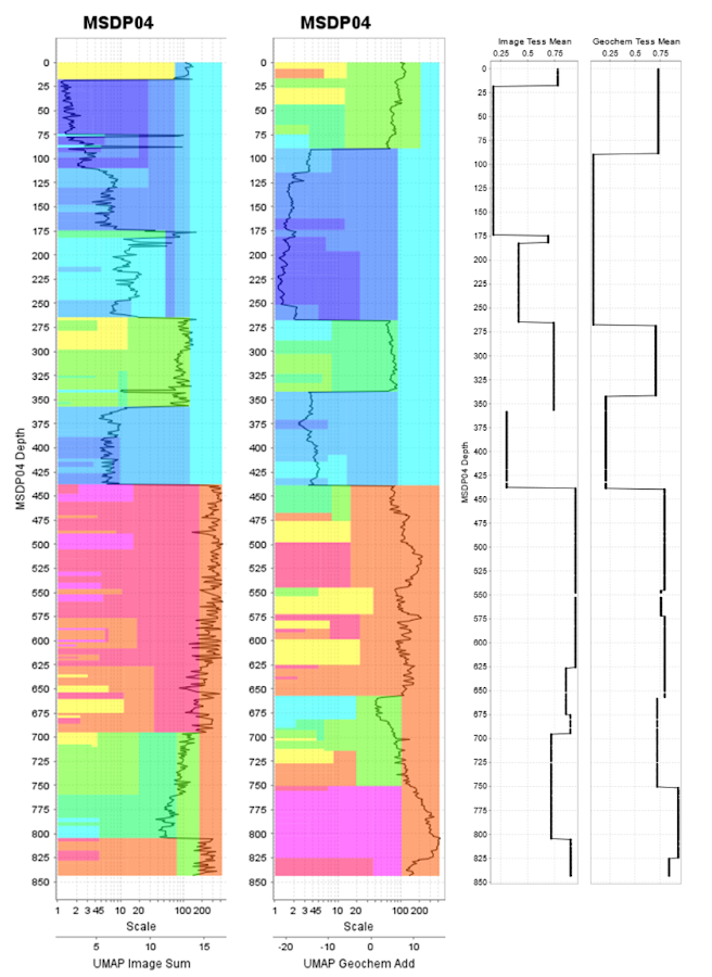
Figure 8. Comparison of sum of the UMAP vectors for both imagery (far left) and geochemistry data analysed using the Wavelet Tessellation tool in ioGAS (right). Average UMAP value per tessellation showing the comparison of boundaries in each dataset.
When we compare the domains created using unsupervised clustering techniques on both imagery and geochemistry data, we can see similarities in boundaries identified between major domains and also some interesting differences. In the figure below we have added the core photography in these boundary regions.
- An image based boundary within the Basalt unit that doesn’t seem to be strong in the geochemistry but is visually and texturally distinct, defined by the rock getting darker and a reduction in the number of light coloured crystals.
- A boundary that is strong in both datasets between the Basalt and Rhyolite
- A boundary that is strong in both datasets between Rhyolite and Volcanics
- A boundary that is strong in both datasets between Basalt and Dolerite
- A boundary within the Dolerite that is not present in the geochemistry but has a distinct lighter grey colour.
The A and E boundaries, along with some more subtle domain boundaries were identified mainly in the imagery data apparently in rocks that are compositionally similar but texturally different highlighting the benefit of using both datasets in concert.
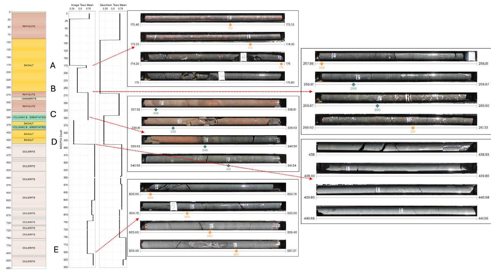
Figure 9. (right) Average UMAP value per tessellation showing the comparison of boundaries in each dataset. (right) Core photos with several key boundary locations showing the change in the visual appearance of the geology.
Locating boundary positions with distance metrics
We calculated Euclidean distances between observations in the UMAP embeddings and plotted these down the hole to reveal natural boundaries and the magnitude of these boundaries. This approach helps visualise the rate of change in samples and provides a spatial understanding of boundaries at various scales (Figure 10). Combining wavelet tessellation with Euclidean distance analysis effectively highlights significant geological boundaries and offers insights into more nuanced ones.
Unsupervised imagery domains are less discrete in the upper half of the hole where the extrusive rocks are. Unsupervised geochemistry domains are more detailed in the lower half of the hole within the intrusive units. There are more discrete domains in the lower half of the hole in the unsupervised imagery classification. The two unsupervised approaches are found to be complementary to one another, where there is little geochemical variation in the lower half of the hole, there is greater dominant RGB variability in this section which resulted in higher variability in the number of subdomains.
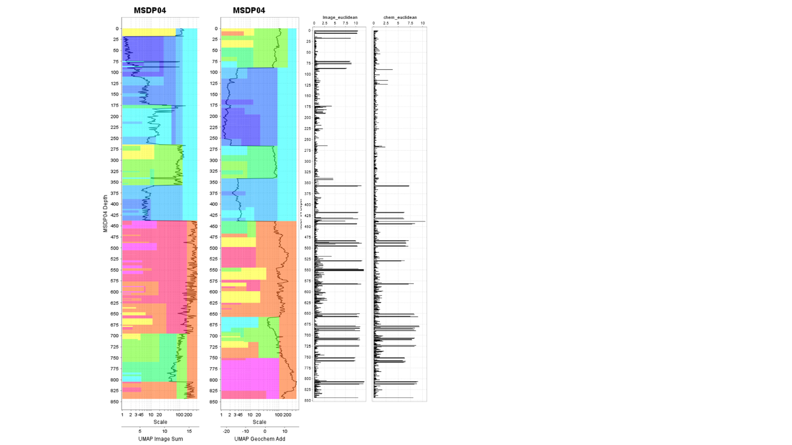
Figure 10. Comparison of sum of the UMAP vectors for both imagery (far left) and geochemistry data analysed using the Wavelet Tessellation tool in ioGAS. Euclidean distances were calculated on the imagery and geochem UMAP embedding, which can be plotted down the hole (two plots on the right).
Comparison with GSSA Logging and Geochemical classification diagrams
The last step in our interpretation is in ‘ground-truthing’ with real logged lithologies by the GSSA (Fig 11), and also by looking at the geochemical context that can explain why we see these boundaries in the geochemical UMAP embedding. The Pearce (1996) diagram (Figure 12) is a immobile element proxy of the TAS igneous classification diagram, and in the section of the diagram highlighted in this image, the bottom cluster is geochemically homogeneous but we see some variability in the RGB data.
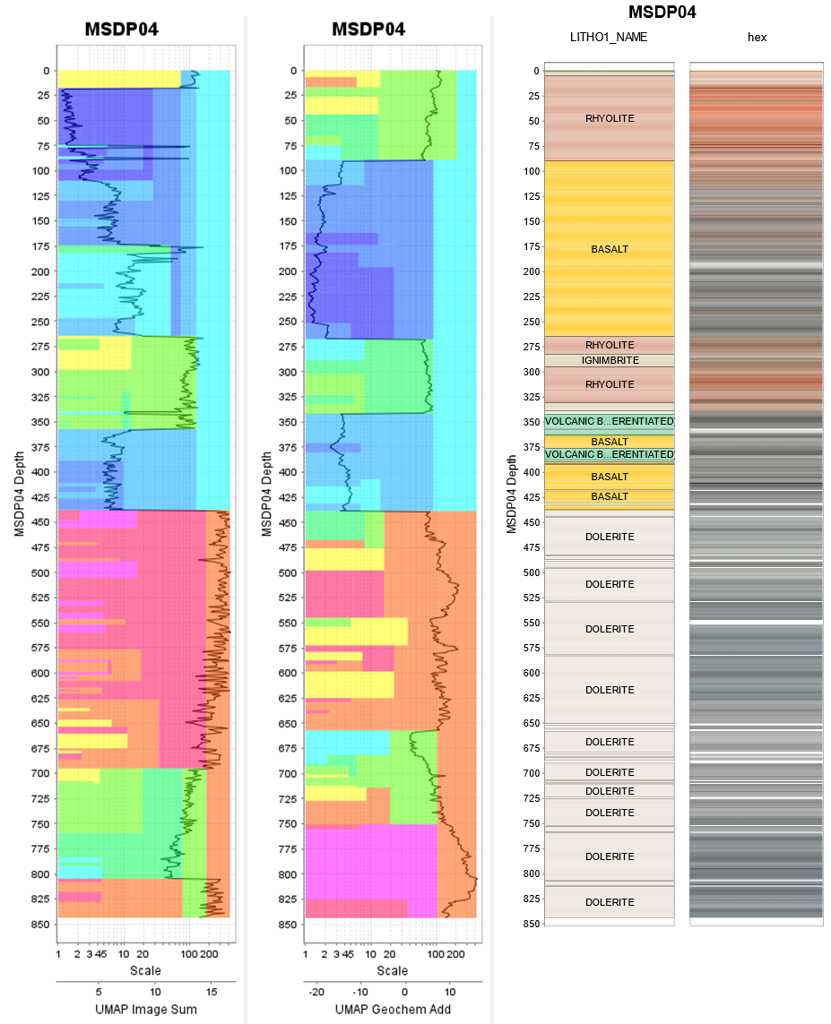
Figure 11. Wavelet tessellation of the sum of UMAP vectors, plotted alongside logged GSSA lithology groups, and dominant RGB colour per interval. This highlights the commonalities and differences between the two unsupervised approaches. Both methods describe the same major trends within the larger scale of the tessellation result, but with differences in the smaller scale (i.e., to the left in the tessellation plot).
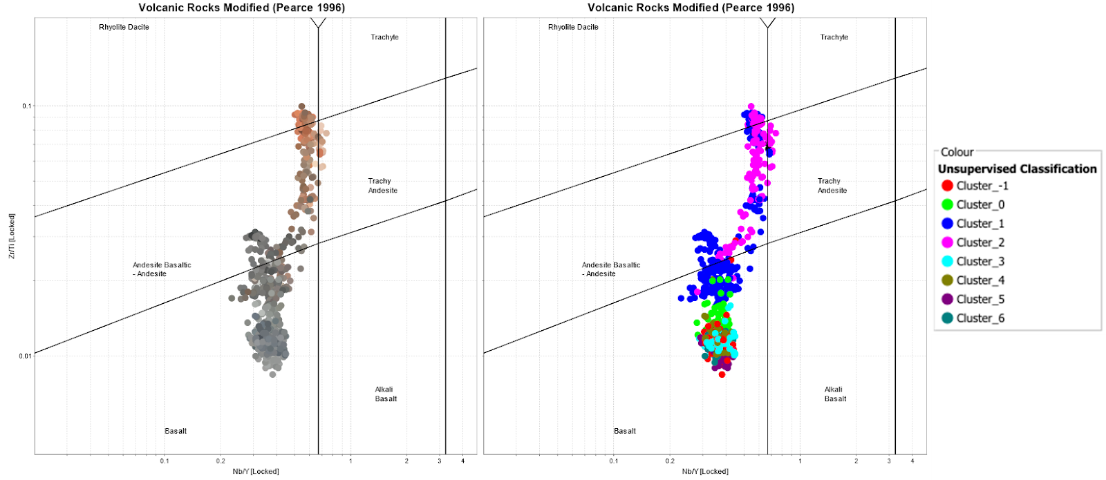
Figure 12. Pearce (1996) volcanic classification diagram, coloured using dominant RGB colour on the left, and unsupervised imagery clusters on the right.
Conclusion
This blog post showcases the integration of core imagery and geochemistry data, where we have demonstrated the benefits of analysing and domaining imagery and geochemistry together.
By using readily available core photography that is processed by the Datarock Platform combined with powerful geochemical data and workflows in ioGAS it is possible to explore not only geochemical processes and domains but also explore and contrast with image colour and texture domains. These dataset show different but complementary geological information that when combined with data analysis tools such as ioGAS can rapidly assist in building a quantitative understanding of geology.
Datarock is on a mission to elevate the status of the simple core photo and transform raw core photography into analytics ready data, allowing for the creation of models that can be numerically analysed alongside geochemical data.
The Datarock Applied Science team utilises their expertise in data science, machine learning and data engineering to build production workflows that transform downhole data into actionable insights for mining operations.
If you would like to know more about what we do at Datarock reach out to the team at https://datarock.com.au/contact/
If you would like to know more about ioGAS then head to their website at https://reflexnow.com/product/iogas/
References
Pearce, J.A. (1996) A User’s Guide to Basalt Discrimination Diagrams. In: Wyman, D.A., Ed., Trace Element Geochemistry of Volcanic Rocks: Applications for Massive Sulphide Exploration, Geological Association of Canada, Short Course Notes, Vol. 12, 79-113.
Fabris 2017, Geological outcomes of the Mineral Systems Drilling Program along the southern Gawler Ranges, MESA Journal 85(4)