
Created by Eleanor Mare
We at Datarock are big fans of UMAP (Uniform Manifold Approximation and Projection), as followers of this blog may have noticed. We find the UMAP algorithm to be useful in a wide variety of contexts. However, UMAP does have its pitfalls, and in this post I want to dive into one of them that I feel is not often discussed.
Let’s start with a quick example of the kinds of problems UMAP can help with. Imagine you had chemical analyses for a large number of rock samples. Each sample was analysed for a suite of say 20 elements. If you want to visualise the distribution of this dataset, you might plot these different elements against each other on 2D scatter plots, or make ternary diagrams (or even 3D scatter plots). But visualising more than three dimensions isn’t possible, and that’s where UMAP comes in.
UMAP is a fairly recent addition to a class of algorithms for what’s known as “dimensionality-reduction” – taking a dataset with a large number of dimensions; capturing, in some way, the essence of that high-dimensional space; and translating that essence into a smaller number of variables. I’m not going to detail how this works, but if you want to know more, see the excellent StatQuest video for a really nice explanation.
In our example of the geochemical analyses, you might reduce the 20 elements into just two ‘UMAP dimensions’, which you can then plot, and this can illuminate the overall structure of the data. UMAPs can also be used as a first step in clustering data. If there are distinctive clusters in your original high-dimensional data (e.g. particular element associations in different rock types), you should see those clusters appear when you plot the data in UMAP space. You can then use clustering methods like k-means directly on the UMAP-transformed data. So far so good.
However, it’s easy to forget that there is uncertainty in the UMAP coordinates. Well, “uncertainty” is not strictly the correct term, but the UMAP algorithm is inherently stochastic (the StatQuest video linked above explains this quite well). This has two consequences.
First, UMAPs are not inherently reproducible. Reproducible UMAP transformations can be obtained, but only in specific situations, as we will discuss.
Second, for any particular data point, you could consider there to be some “uncertainty” on its UMAP coordinates. UMAP space is not euclidean (e.g. the distance between clusters is not meaningful), so it doesn’t really make sense to imagine each point in a UMAP having an error bar on it. But without a visual representation of uncertainty/stochasticity, it can be easy to forget that it exists.
The “uncertainty” of the UMAP coordinates is usually going to be pretty small, and not something for concern. However, this is not always the case, and in this post we will investigate this phenomenon using synthetic data.
The synthetic dataset
We’ll start this example by creating some fake data. To keep things simple, we’ll create data with three features that we can plot on a 3D scatterplot, and we’ll transform this data into 2D UMAPs. Because we can visualise both the original and the transformed data, it will be easier to understand what’s going on.
The synthetic data is made of four clusters in 3D space. Each cluster is a Gaussian distribution centred at different x-y-z coordinates, and with different “spreads” (covariance matrices – the 3D equivalent of a standard deviation). In the figure below you can see these four clusters, and how they overlap slightly.
The code used to generate these data, and perform all the subsequent analysis can be found on github.
UMAP is not inherently reproducible
Let’s start by investigating reproducibility. Anyone who has done some work with UMAP will probably know that if you run it twice, you’ll get a slightly different-looking output, unless you set the random state or ‘seed’.
To demonstrate this, we’ll create four UMAPS from the data defined above.
-
The initial UMAP, with a seed set
-
Re-run the UMAP with the same seed
-
Re-run the UMAP with a different seed
-
Re-run the UMAP with the same seed as the first two, but shuffle the input data
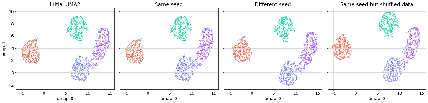
The UMAPs look pretty nice. There are clearly four clusters that correspond to the clusters in the higher-dimensional space. The blue and purple clusters are slightly joined, which makes sense because in the 3D plot you can see there’s more overlap between these two clusters than the others.
In terms of reproducibility, it probably won’t be a surprise that if you run a UMAP twice on the same data using the same seed you get an identical result (left two panels), and that if you use a different seed you get a slightly different result (middle two panels).
What’s probably less well-known is that setting the seed only allows for reproducibility if the data is exactly the same. If you were running the UMAP with only a subset of the data, or even with exactly the same data but in a different order, you’ll get a slightly different result. This is shown in the far right panel of the figure above. The shape of the UMAP looks very similar to that in the far left panel, but it’s not identical (notably the green cluster is at a higher position on the y-axis).
How far did each point “move”?
It’s worth taking a look at where each data point plots between one UMAP and another. In this case let’s look at the difference between the initial UMAP (far left panel) and the UMAP made with the same seed but with shuffled data (rar right panel).

The histogram above shows the distribution of euclidean distances between the first and second UMAP coordinates for each data point. Mostly these distances are very small (note the log scale on the y-axis), but there are a handful of points that appear to have “moved” quite a lot.
Let’s investigate just those points that have “moved” more than two units in UMAP space. In the figure below, the left panel shows the initial positions of these points (black filled circles) in the context of the first UMAP. The right panel plots these same data points (as black crosses) in the second UMAP, with a line connecting them to their initial locations from the first UMAP to show how “far” they “moved”. (Note: lots of use of quotation marks because no movement was actually involved, and because of the non-euclidean nature of UMAP space!).
The key thing to notice is that, between one UMAP and another, some data points end up being projected into different clusters.

Let’s take a look at where these anomalous points were in the original, 3-dimensional data.
As you might have guessed, these points were all near the edges of clusters, and even in 3D space, it’s somewhat ambiguous which cluster they should belong to. The stochasticity of the algorithm will sometimes place them in one cluster, and sometimes in another.
However, if you used the UMAP for dimensionality-reduction, and then created clusters from the UMAP variables using something like k-means clustering, you’d get no sense of this “uncertainty”. The data in UMAP space *looks* completely clear-cut. Points in the green cluster *look* “really far away” from points in the blue cluster, and it’s easy to forget the fact that the “space” between the two clusters isn’t euclidean space.
I read somewhere that making a UMAP is analogous to trying to make a map of the world. The world is a sphere, so to lay it out as a flat map you need to choose where the edges are – do you split it down the Pacific ocean, or the Atlantic? No matter where you choose, points on one side of the map will look, in “map space” really far away from points on the other side, when in fact they are very close. The map is still useful, but this limitation needs to be kept in mind. (I read this analogy somewhere online and now I can’t remember where, or find a reference to it, so my apologies).
Who cares?
In our work at Datarock we have found UMAP to be a very useful tool. Limitations like this do not undermine the utility of the algorithm. However, when working in mineral exploration, we are often trying to search for anomalies in the data that might lead us to new deposits. In this context, it’s important to remember this “uncertainty” in UMAP coordinates and clusters derived from UMAP coordinates. Anomalies in UMAP coordinates could result from stochasticity rather than anything inherent in the data.
Further reading
To learn more I’d highly recommend the following sources:
* UMAP documentation from scikit-learn.
